

How to Choose the Perfect Wall Color for Every Room and Every Person in Your Home
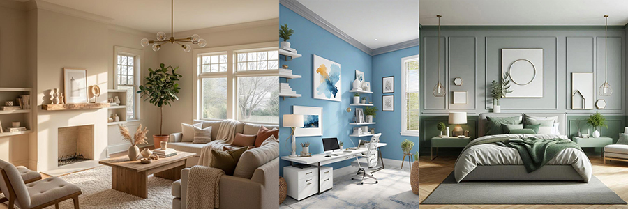
Choosing a paint color is one of the most exciting parts of decorating a home—but it can also be one of the most difficult.
With hundreds of shades to choose from, it's easy to ask:
"Which color looks the best?"
A better question is:
"How do I want this room to feel?"
The colors surrounding us influence how we experience a space. While paint colors aren't a treatment for stress, anxiety, or sleep problems, studies in environmental psychology and interior design suggest they can influence our perception of comfort, warmth, energy, and relaxation.
The perfect wall color doesn't just match your furniture—it complements your lifestyle, your home's lighting, and the people who use the room every day.
Whether you're creating a peaceful bedroom, a lively children's room, or a welcoming living area, choosing the right paint color can transform a house into a home.
This guide will help you select colors based on:
- The people using the room
- Natural and artificial lighting
- Room function
- Color psychology
- Paint finishes
- Practical decorating tips
Let's begin.
Table of Contents
- Why Wall Color Matters
- Best Colors for Children's Rooms
- Best Colors for Busy Professionals
- Best Colors for Elderly Family Members
- Best Bedroom Colors for Better Sleep
- Best Colors for Family Living Spaces
- Choosing Colors for Home Offices
- How Lighting Changes Paint Colors
- Understanding Color Psychology
- Choosing the Right Paint Finish
- Frequently Asked Questions
- Final Tips Before Painting
Why Wall Color Matters
Wall color is much more than decoration.
It creates atmosphere.
Think about walking into two different bedrooms:
- One has bright red walls with cool white lighting.
- Another has soft sage green walls illuminated by warm lighting.
Both rooms contain the same furniture, yet they feel completely different.
This is because our brains naturally associate different colors with different environments.
Soft blues often remind us of open skies.
Greens evoke nature.
Warm beige creates feelings of comfort.
Earthy terracotta feels welcoming and grounded.
These are general psychological associations rather than universal rules. Personal preferences, cultural influences, lighting conditions, and décor all shape how a space feels.
Instead of chasing trends, choose colors that support how you want each room to function.
👶 Best Colors for Children
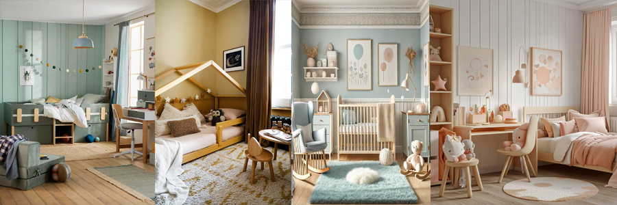
Children need spaces that encourage creativity while also providing moments of calm.
Although bright colors can be exciting, covering every wall with highly saturated reds, oranges, or yellows may make a room feel visually busy. Softer shades create an environment that feels cheerful without becoming overwhelming.
|
Shade |
Color Code |
Why It Works |
|
Soft Sky Blue |
3-36-2 |
Creates a calm, airy feeling. |
|
Sage Green |
5-26-2 |
Inspired by nature and easy on the eyes. |
|
Warm Butter Yellow |
3-9-2 |
Adds warmth without being overpowering. |
|
Soft Peach |
5-4-2 |
Friendly, gentle, and comforting. |
Design Tips
✔ Pair pastel walls with white furniture.
✔ Add colorful toys instead of painting every wall brightly.
✔ Choose washable premium interior paint for easy cleaning.
✔ Consider an accent wall instead of four bold walls.
Best Paint Finish
Satin Finish
Children naturally touch walls more often than adults. Satin finishes are easier to clean than completely matte paints while still providing a soft appearance.
👨💻 Best Colors for Busy Professionals
After spending an entire day in meetings, commuting, or working on a computer, your home should help you disconnect from work.
Muted colors create visual balance and pair beautifully with natural wood furniture, indoor plants, and soft lighting.
|
Shade |
Color Code |
Best For |
|
Sage Green |
4-19-3 |
Relaxation after work |
|
Dusty Blue |
3-36-3 |
Reading corners and bedrooms |
|
Warm Greige |
5-11-2 |
Living rooms |
|
Soft Taupe |
5-9-1 |
Minimalist interiors |
Styling Ideas
Combine these shades with:
- Oak or walnut furniture
- Linen curtains
- Indoor plants
- Warm white lighting
- Natural woven rugs
This combination creates a timeless interior that won't feel outdated after a few years.
Best Paint Finish
Eggshell Finish
Eggshell offers a soft appearance with slightly better durability than flat matte paint, making it ideal for living rooms and home offices.
👵 Best Colors for Elderly Family Members
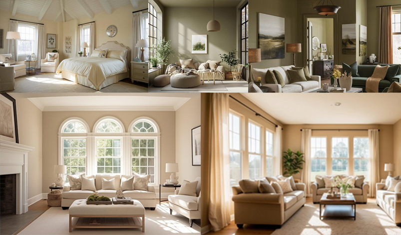
As we grow older, our eyes naturally perceive contrast differently. Extremely dark colors may make rooms feel smaller, while very bright white walls can sometimes create glare under strong lighting.
Warm neutral colors often provide a comfortable balance.
|
Shade |
Color Code |
Best For |
|
Warm Cream |
1-8-2 |
Relaxation after work |
|
Light Beige |
3-9-1 |
Reading corners and bedrooms |
|
Soft Olive |
4-19-1 |
Living rooms |
|
Warm Greige |
4-10-3 |
Minimalist interiors |
Helpful Design Tips
- Maximize natural daylight whenever possible.
- Choose warm LED lighting (2700K–3000K) in the evening.
- Maintain good contrast between walls, floors, and furniture for easier navigation.
- Avoid extremely glossy finishes that may create reflections.
Best Paint Finish
Matte or Eggshell
These finishes reduce glare while maintaining an elegant appearance.
😴 Best Colors for Better Sleep
Your bedroom should feel like a retreat from the outside world.
Although no paint color can guarantee better sleep, choosing calming shades and soft lighting can help create a relaxing environment that's easier to unwind in after a long day.
|
Shade |
Color Code |
|
Misty Blue |
2-27-3 |
|
Lavender Grey |
5-41-2 |
|
Sage Green |
4-19-4 |
|
Soft Stone Grey |
5-36-2 |
Why These Colors Work
These muted tones reduce visual stimulation and pair well with natural materials such as wood, cotton, and linen.
For an even cozier atmosphere:
- Use warm white lighting (2700K–3000K).
- Layer curtains to control daylight.
- Keep decorative accessories simple.
- Introduce soft textures through bedding and rugs.
Avoid
Very bright reds, neon oranges, or highly saturated yellows in bedrooms if your goal is to create a restful atmosphere. While they can be effective as accent colors, using them on every wall may make the room feel more energetic than relaxing.
👨👩👧 Best Colors for Family Spaces
The living room is where families gather, guests are welcomed, and memories are made. Because it's one of the most frequently used spaces in the home, the wall color should feel warm, comfortable, and timeless.
Instead of following short-lived color trends, choose shades that create a welcoming atmosphere and work well with different furniture styles over the years.
|
Shade |
Apollo Code |
|
Warm Beige |
DCCBB8 |
|
Terracotta |
C97B63 |
|
Olive Green |
7D8B5A |
|
Greige |
C8C0B7 |
Styling Tips
- Pair warm neutrals with wooden furniture for a timeless look.
- Add indoor plants to complement earthy shades like sage or olive green.
- Use textured cushions and rugs to add depth without making the room feel busy.
- Choose warm white lighting to enhance cozy evening gatherings.
Best Paint Finish
Eggshell or Satin
These finishes offer a subtle sheen, are easy to maintain, and withstand everyday wear in busy family spaces.
How Lighting Changes Paint Colors
One of the biggest mistakes homeowners make is choosing paint under showroom lighting and expecting it to look the same at home.
The exact same paint color can appear completely different depending on the amount and direction of natural light, as well as the type of artificial lighting you use.
North-Facing Rooms
North-facing rooms receive cooler, softer daylight throughout the day.
Cool-toned paints may appear dull or slightly bluish in these spaces.
Recommended Colors
- Warm White
- Cream
- Beige
- Warm Greige
- Soft Peach
Avoid: Bright, icy whites if you want the room to feel warm and inviting.
South-Facing Rooms
South-facing rooms receive abundant natural sunlight, making them the easiest spaces to decorate.
Most colors appear vibrant and true to their original shade.
Recommended Colors
- Sage Green
- Dusty Blue
- Soft Grey
- Warm Beige
- Greige
Both warm and cool colors perform beautifully in these rooms.
East-Facing Rooms
Morning sunlight gives east-facing rooms a warm glow, while afternoons become cooler.
Recommended Colors
- Sage Green
- Warm Greige
- Soft Beige
- Cream
These colors maintain a balanced appearance throughout the day.
West-Facing Rooms
West-facing rooms receive intense golden sunlight during the afternoon and evening.
Warm colors can appear even warmer under this light.
Recommended Colors
- Taupe
- Muted Green
- Soft Grey
- Warm White
Avoid: Strong yellow shades if you don't want the room to feel overly warm in the evening.
Artificial Lighting Matters Too
Even after sunset, your lighting affects how wall colors appear.
Warm White (2700K–3000K)
Creates a cozy and relaxing atmosphere.
Best for:
- Bedrooms
- Living rooms
- Dining rooms
Neutral White (3500K–4000K)
Provides balanced lighting without feeling too warm or too cool.
Best for:
- Home offices
- Hallways
- Kitchens
Cool White (5000K+)
Appears bright and crisp but can make warm paint colors look less inviting.
Use carefully in residential interiors unless a very modern aesthetic is desired.
Understanding Color Psychology
Color psychology explores how different colors are commonly associated with particular feelings and environments. These are general tendencies rather than universal rules—personal taste, culture, lighting, and décor all play an important role.
|
Color |
Common Feeling |
Best Rooms |
|
🟢 Green |
Calm, balanced, natural |
Living room, office, bedroom |
|
🔵 Blue |
Peaceful, relaxing |
Bedroom, study |
|
🟡 Yellow |
Cheerful, optimistic |
Kitchen, breakfast area |
|
🟠 Terracotta |
Warm, welcoming |
Living room |
|
🤍 Warm White |
Clean, cozy |
Almost every room |
|
⚪ Cool Grey |
Modern, elegant |
Offices, contemporary homes |
Remember, these are general associations rather than guaranteed effects. Individual preferences, culture, lighting, and décor all influence how a room feels.
Choosing the Right Paint Finish
Selecting the right finish is just as important as choosing the right color. Different finishes affect durability, maintenance, and the overall look of a room.
|
Finish |
Best For |
Benefits |
|
Matte |
Bedrooms, ceilings |
Soft appearance, hides minor wall imperfections |
|
Eggshell |
Living rooms, dining rooms |
Elegant look with improved durability |
|
Satin |
Children's rooms, hallways |
Easy to clean and resistant to everyday wear |
|
Semi-Gloss |
Kitchens, bathrooms, doors, trim |
Moisture-resistant and easy to wipe clean |
Quick Tip
High-traffic areas benefit from more durable finishes, while quieter spaces often look best with low-sheen finishes that create a soft, sophisticated appearance.
Designer Tips for a Beautiful Interior
Before choosing your paint, keep these professional tips in mind:
- Test before you commit. Paint a sample on different walls and observe it at different times of the day.
- Consider your existing décor. Flooring, curtains, furniture, and natural light all influence how a color looks.
- Limit bold colors to accent walls. This adds personality without overwhelming the room.
- Use a consistent palette. Repeating complementary colors throughout the home creates a sense of flow.
- Think long-term. Neutral shades tend to adapt better as furniture and décor change over time.
Common Mistakes to Avoid When Choosing Wall Colors
Even the highest-quality paint can disappoint if the wrong color is selected. Avoid these common mistakes before starting your next painting project.
1. Choosing Paint Under Store Lighting
Paint samples often look very different under showroom lights than they do at home.
Tip: Always test a sample on your own walls and observe it in the morning, afternoon, and evening.
2. Ignoring Natural Light
A north-facing bedroom and a south-facing living room won't show the same shade in the same way.
Always consider:
- Direction of sunlight
- Window size
- Curtains and blinds
- Artificial lighting used at night
3. Following Trends Instead of Lifestyle
A trendy color may look beautiful online but might not suit your furniture, flooring, or personal taste.
Choose colors you'll enjoy living with for years—not just the latest trend.
4. Using Too Many Bold Colors
Bright accent colors can add personality, but using several strong colors throughout the home can make spaces feel visually cluttered.
A balanced palette of neutral walls with colorful décor is often more timeless.
5. Forgetting the Paint Finish
Color gets most of the attention, but the finish affects how walls look, reflect light, and stand up to everyday wear.
Choose a finish that matches the room's purpose as well as its style.
Frequently Asked Questions
Which wall color makes a room look bigger?
Light shades such as warm white, cream, soft beige, and light greige reflect more light, helping smaller rooms feel more open and spacious.
What is the best wall color for a bedroom?
Soft blues, sage greens, lavender greys, and warm neutrals are popular choices because they create a peaceful, relaxing environment.
Which colors work best in living rooms?
Warm beige, greige, olive green, and soft terracotta create inviting spaces that pair well with a wide range of furniture styles.
Should every room in the house be the same color?
Not necessarily. Using complementary colors throughout the home creates variety while maintaining a cohesive overall look.
Does lighting really change paint colors?
Yes. Natural daylight, warm LED lighting, and cool white lighting can all change how a paint color appears. That's why it's always recommended to test paint samples before making a final decision.
Which paint finish is easiest to clean?
Satin and semi-gloss finishes are generally easier to wipe clean than matte finishes, making them suitable for children's rooms, hallways, kitchens, and other high-traffic areas.
Pro Tips from Apollo Paints
Choosing a paint color is easier when you plan ahead.
Before painting:
✔ Test sample colors on different walls.
✔ View them at different times of day.
✔ Match paint with your flooring, furniture, and curtains.
✔ Consider how the room will be used.
✔ Select the appropriate paint finish for durability and maintenance.
Taking these simple steps can help you choose a color you'll enjoy for years to come.
Final Thoughts
The perfect wall color isn't simply the most fashionable shade—it's the one that supports the way you live.
Every room in your home serves a different purpose. A bedroom should feel restful, a living room welcoming, a home office focused, and a children's room cheerful yet comfortable. By considering who uses the space, how much natural light it receives, and the atmosphere you want to create, you can make choices that are both practical and beautiful.
Remember that paint is more than decoration. It's one of the easiest and most effective ways to transform the feeling of your home.
With thoughtful color selection and the right finish, every room can become a space you'll enjoy spending time in.
Ready to Transform Your Home?
Whether you're refreshing a single room or planning a complete home makeover, Apollo Paints offers a wide range of interior colors and finishes designed to help you create spaces that reflect your style and everyday life.
Explore our interior paint collections, browse our shade card, or visit your nearest Apollo Paints dealer for expert guidance in choosing the perfect colors for your home.
Beautiful homes begin with the right color.
Written by Umesh (Abishek)
PR & Business Growth Executive (Graphic Design & Branding)


